Q SPACE
Dream Mall
Q SPACE Dream Mall
Kaohsiung Dream Mall Booth Design|Creating the “Q SPACE” Brand Space
This project, located in Kaohsiung Dream Mall, had a unique spatial condition. Instead of one complete booth, it was divided into three separate zones. For us, this challenge was not only about floor layout, but about the bigger theme of commercial space design: how to create a consistent brand impression across scattered points through design strategy. For this project, we placed special emphasis on two core ideas—“spatial connection” and “brand experience.”
As Woosha Design, a Taichung-based interior design studio, we specialize in department store booth design, large-scale retail store design, and flagship planning, with extensive experience in Kaohsiung, Taichung, and Taipei.
Design Strategy|Form and Color as the Starting Point
The booth design strategy began with form and color. Form-wise, we used curved shapes as the core, inspired by childhood memories of playgrounds—the sense of spinning, expanding, and exploring. Extending outward, the curved partitions naturally connect the circulation flow and visually create a unified impression.
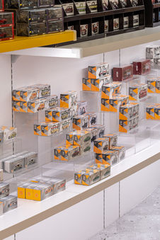
The central display cabinet combined transparent materials with brand visuals, echoing the theme of “Flip & Find,” bringing a sense of playful discovery. Lighting was designed with multi-layered circular fixtures, giving the space a rhythmic, playground-like atmosphere. This approach is exactly what large-scale retail design companies value most: not just surface finishes, but creating an atmosphere where customers want to stay.
Color Zoning|Defining Functions, Strengthening Identity
The three zones were distinguished by color while extending the brand’s three primary tones.
-
The Lifestyle Zone, in gray with natural wood, conveyed tranquility and texture—ideal for everyday products.
-
The Technology Zone, with a bold contrast of purple and yellow, highlighted futurism and interactivity, giving tech products a stage of their own.
-
The Flip & Find Zone, centered on yellow, formed a strong visual identity as the core showcase area.
Paired with wood tones, the overall effect was clean, bright, and approachable. A mix of wood, metal, and acrylic materials added transparency and playfulness, echoing both the brand’s childlike spirit and its modernity.
Ceiling & Character Integration|Freedom and Experimentation
For the ceiling, we chose to keep the original light-steel framework, arranging T8 tubes in random order. This deliberate rawness expressed the brand’s sense of “freedom” and “experimentation.” The brand character, the Chuang Q monster, went beyond walls and display counters—boldly extending into ceiling installations as a main visual highlight. This not only reinforced brand memorability but also infused interactivity and friendliness, as if stepping into the monster’s playground.
Flooring Graphics|Directing the Experience
The flooring graphics played the role of “director,” using the brand’s three key colors to link the three booths into fun pathways. As customers explored, they were subtly guided across all areas, deepening their brand experience and memory.
Through the integration of curves, color strategy, and brand characters, visitors entering the booth could immediately sense playfulness and the joy of exploration. What began as three separate booths was ultimately connected into one engaging and distinctive brand space through design.
Photography / Positive Photography
| Department Store Booth Design | Commercial Design | Commercial Space | Taichung Interior Design | Spatial Design |


